Exploring Exercise Response Across Multi-Omics from a Custom Gene List
David Jimenez-Morales
MoTrPAC Bioinformatics Center, Stanford Universitymotrpac-helpdesk@lists.stanford.edu
rat-training-6m-custom-gene-list.RmdSummary
This interactive workflow enables you to explore how your genes of interest respond to endurance exercise training across multiple tissues and molecular layers in the MoTrPAC rat study.
What you’ll get:
- Dataset Overview: Visualization of all available multi-omics data (transcriptomics, proteomics, metabolomics, etc.)
- Gene Coverage: Automatic mapping of your genes across different omics platforms and tissues
- Interactive Tables: Searchable, filterable results showing log fold-changes and significance
- Trajectory Plots: visualizations of how your genes change over the training time course (1w, 2w, 4w, 8w)
- Heatmaps: Sex-specific comparison of gene responses across tissues and time points with significance markers
- Multi-Tissue Insights: Identify tissue-specific and sex-specific exercise responses
Just provide your gene list, and this notebook will automatically retrieve and visualize endurance training effects across the comprehensive MoTrPAC dataset spanning 7 omics platforms and 20 tissues!
Introduction
This vignette demonstrates how to explore a custom gene list across the MoTrPAC endurance exercise training multi-omics dataset. The workflow is designed to help you:
- Input your own gene list of interest
- Retrieve differential analysis results across multiple omics layers and tissues
- Visualize temporal trajectories showing how genes respond over 1-8 weeks of training
- Compare responses between males and females, and across different tissues
- Identify significant training-induced changes (FDR < 0.05)
Required Packages
To facilitate access to and analysis of this extensive dataset, two essential R packages are used:
- MotrpacRatTraining6moData: Provides access to the processed data and downstream analysis results from the MoTrPAC endurance exercise study.
- MotrpacRatTraining6mo: Offers functions to help retrieve and explore the data, enabling users to perform analyses and reproduce key findings from the study.
Define Your Gene List
Start by defining a custom gene list. This can be any set of genes you’re interested in exploring. Here we use an example list of genes related to metabolism and exercise response:
# Example gene list - Replace with your genes of interest
custom_genes <- c(
  "Ppargc1a",
  "Vegfa",
  "Hif1a",
  "Pdk4",
  "Ucp1",
  "Myh7",
  "Acadm",
  "Slc2a4",
  "Cpt1b",
  "Nrf1"
)

cat("Your gene list contains", length(custom_genes), "genes:\n")
#> Your gene list contains 10 genes:
print(custom_genes)
#>  [1] "Ppargc1a" "Vegfa"    "Hif1a"    "Pdk4"     "Ucp1"     "Myh7"
#>  [7] "Acadm"    "Slc2a4"   "Cpt1b"    "Nrf1"
Retrieve Multi-Omics Data
Overview of Available Datasets
Before diving into your custom gene list, let’s explore what differential analysis datasets are available in the MoTrPAC rat endurance training study:
# Load the differential analysis results
da_results <- combine_da_results()
#> Warning in combine_da_results(): 'include_epigen' is FALSE. Excluding ATAC and METHYL results.
#> ACETYL_HEART_DA
#> ACETYL_LIVER_DA
#> IMMUNO_ADRNL_DA
#> IMMUNO_BAT_DA
#> IMMUNO_COLON_DA
#> IMMUNO_CORTEX_DA
#> IMMUNO_HEART_DA
#> IMMUNO_HIPPOC_DA
#> IMMUNO_KIDNEY_DA
#> IMMUNO_LIVER_DA
#> IMMUNO_LUNG_DA
#> IMMUNO_OVARY_DA
#> IMMUNO_PLASMA_DA
#> IMMUNO_SKMGN_DA
#> IMMUNO_SKMVL_DA
#> IMMUNO_SMLINT_DA
#> IMMUNO_SPLEEN_DA
#> IMMUNO_TESTES_DA
#> IMMUNO_WATSC_DA
#> METAB_ADRNL_DA_METAREG
#> METAB_BAT_DA_METAREG
#> METAB_COLON_DA_METAREG
#> METAB_CORTEX_DA_METAREG
#> METAB_HEART_DA_METAREG
#> METAB_HIPPOC_DA_METAREG
#> METAB_HYPOTH_DA_METAREG
#> METAB_KIDNEY_DA_METAREG
#> METAB_LIVER_DA_METAREG
#> METAB_LUNG_DA_METAREG
#> METAB_OVARY_DA_METAREG
#> METAB_PLASMA_DA_METAREG
#> METAB_SKMGN_DA_METAREG
#> METAB_SKMVL_DA_METAREG
#> METAB_SMLINT_DA_METAREG
#> METAB_SPLEEN_DA_METAREG
#> METAB_TESTES_DA_METAREG
#> METAB_VENACV_DA_METAREG
#> METAB_WATSC_DA_METAREG
#> PHOSPHO_CORTEX_DA
#> PHOSPHO_HEART_DA
#> PHOSPHO_KIDNEY_DA
#> PHOSPHO_LIVER_DA
#> PHOSPHO_LUNG_DA
#> PHOSPHO_SKMGN_DA
#> PHOSPHO_WATSC_DA
#> PROT_CORTEX_DA
#> PROT_HEART_DA
#> PROT_KIDNEY_DA
#> PROT_LIVER_DA
#> PROT_LUNG_DA
#> PROT_SKMGN_DA
#> PROT_WATSC_DA
#> TRNSCRPT_ADRNL_DA
#> TRNSCRPT_BAT_DA
#> TRNSCRPT_BLOOD_DA
#> TRNSCRPT_COLON_DA
#> TRNSCRPT_CORTEX_DA
#> TRNSCRPT_HEART_DA
#> TRNSCRPT_HIPPOC_DA
#> TRNSCRPT_HYPOTH_DA
#> TRNSCRPT_KIDNEY_DA
#> TRNSCRPT_LIVER_DA
#> TRNSCRPT_LUNG_DA
#> TRNSCRPT_OVARY_DA
#> TRNSCRPT_SKMGN_DA
#> TRNSCRPT_SKMVL_DA
#> TRNSCRPT_SMLINT_DA
#> TRNSCRPT_SPLEEN_DA
#> TRNSCRPT_TESTES_DA
#> TRNSCRPT_VENACV_DA
#> TRNSCRPT_WATSC_DA
#> UBIQ_HEART_DA
#> UBIQ_LIVER_DA

# Get unique combinations of assay and tissue
dataset_summary <- da_results %>%
  select(assay, tissue) %>%
  distinct() %>%
  arrange(assay, tissue)

# Create summary counts
assay_counts <- dataset_summary %>%
  count(assay, name = "n_tissues") %>%
  arrange(desc(n_tissues))

tissue_counts <- dataset_summary %>%
  count(tissue, name = "n_assays") %>%
  arrange(desc(n_assays))

# Create tissue order based on number of assays
tissue_order <- tissue_counts %>%
  arrange(desc(n_assays)) %>%
  pull(tissue)

# Apply factor levels for proper ordering
dataset_summary_ordered <- dataset_summary %>%
  mutate(
    assay = factor(assay, levels = unique(assay)),
    tissue = factor(tissue, levels = tissue_order)
  )

# Get color mappings for available assays and tissues
assay_colors_used <- ASSAY_COLORS[names(ASSAY_COLORS) %in% unique(dataset_summary_ordered$assay)]
tissue_colors_used <- TISSUE_COLORS[names(TISSUE_COLORS) %in% unique(dataset_summary_ordered$tissue)]

# Create presence/absence heatmap with assay colors
phm <- ggplot(dataset_summary_ordered, aes(x = tissue, y = assay)) +
  geom_tile(aes(fill = assay), color = "white", linewidth = 1) +
  scale_fill_manual(values = assay_colors_used) +
  scale_y_discrete(limits = rev(levels(dataset_summary_ordered$assay))) +
  labs(
    title = "Available Differential Analysis Datasets",
    subtitle = "MoTrPAC Rat Endurance Training 6mo Data",
    x = "Tissue",
    y = "Assay"
  ) +
  theme_minimal() +
  theme(
    plot.title = element_text(face = "bold", size = 14, hjust = 0.5),
    plot.subtitle = element_text(size = 11, hjust = 0.5, color = "gray30"),
    axis.title = element_text(face = "bold", size = 12),
    axis.text.x = element_text(angle = 45, hjust = 1, size = 10),
    axis.text.y = element_text(size = 10, face = "bold"),
    panel.grid = element_blank(),
    legend.position = "none"
  )

print(phm)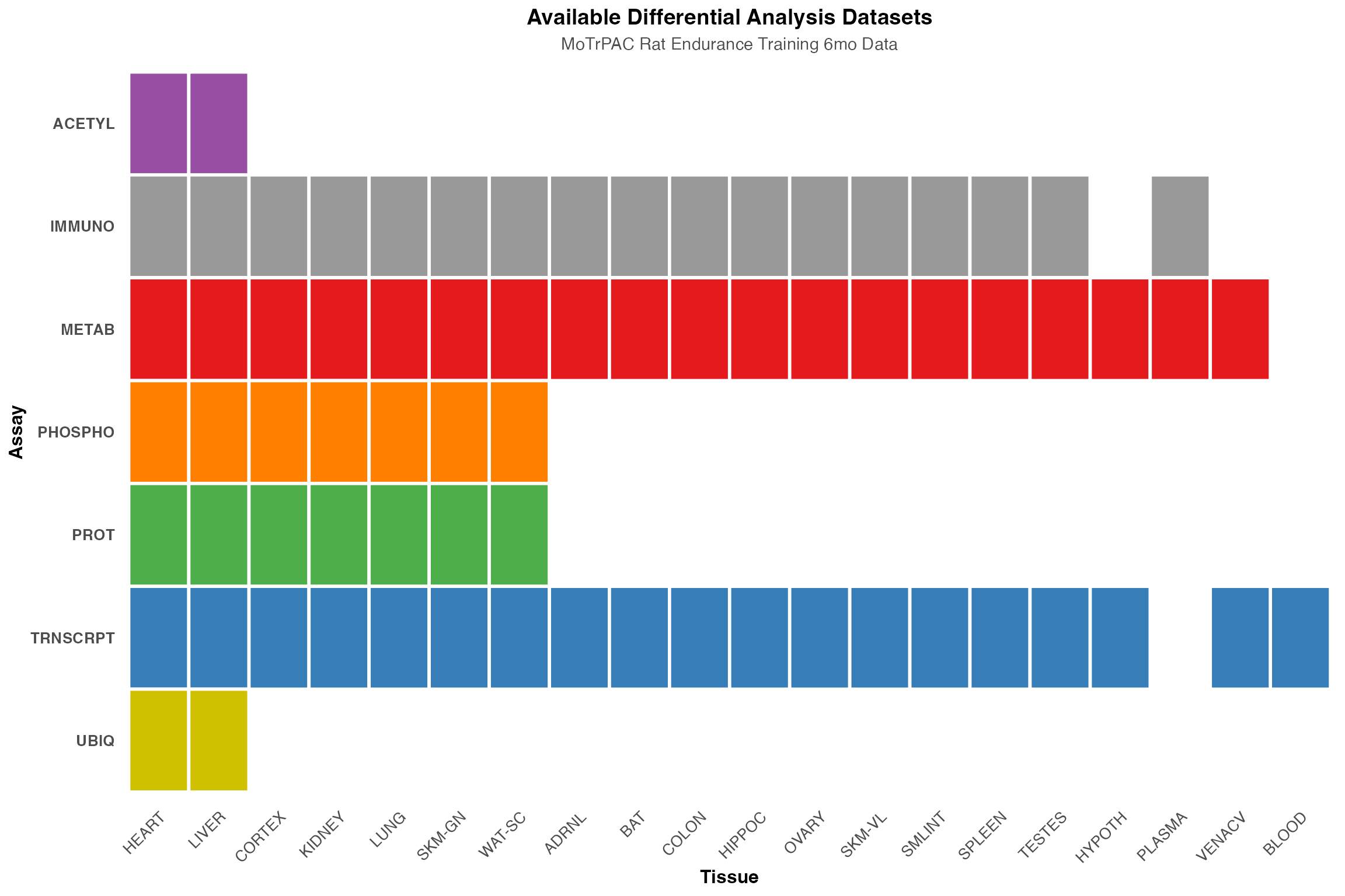
# Create summary bar plots with official colors
p1 <- ggplot(assay_counts, aes(x = reorder(assay, n_tissues), y = n_tissues, fill = assay)) +
  geom_col(width = 0.7) +
  geom_text(aes(label = n_tissues), hjust = -0.3, fontface = "bold", size = 3.5) +
  coord_flip() +
  scale_fill_manual(values = assay_colors_used) +
  scale_y_continuous(expand = expansion(mult = c(0, 0.15))) +
  labs(title = "Datasets by Assay", x = NULL, y = "Number of Tissues") +
  theme_classic() +
  theme(
    plot.title = element_text(face = "bold", size = 12, hjust = 0.5),
    axis.text.y = element_text(face = "bold", size = 9),
    legend.position = "none"
  )

p2 <- ggplot(tissue_counts, aes(x = reorder(tissue, n_assays), y = n_assays, fill = tissue)) +
  geom_col(width = 0.7) +
  geom_text(aes(label = n_assays), hjust = -0.3, fontface = "bold", size = 3) +
  coord_flip() +
  scale_fill_manual(values = tissue_colors_used) +
  scale_y_continuous(expand = expansion(mult = c(0, 0.15))) +
  labs(title = "Datasets by Tissue", x = NULL, y = "Number of Assays") +
  theme_classic() +
  theme(
    plot.title = element_text(face = "bold", size = 12, hjust = 0.5),
    axis.text.y = element_text(face = "bold", size = 8),
    legend.position = "none"
  )

# Print summary information
cat("\n=== Dataset Summary ===\n")
#>
#> === Dataset Summary ===
cat("Total unique assay-tissue combinations:", nrow(dataset_summary), "\n")
#> Total unique assay-tissue combinations: 73
cat("Number of assays:", length(unique(dataset_summary$assay)), "\n")
#> Number of assays: 7
cat("Number of tissues:", length(unique(dataset_summary$tissue)), "\n\n")
#> Number of tissues: 20

cat("Assays available:\n")
#> Assays available:
print(sort(unique(dataset_summary$assay)))
#> [1] "ACETYL"   "IMMUNO"   "METAB"    "PHOSPHO"  "PROT"     "TRNSCRPT" "UBIQ"

cat("\nTissues available:\n")
#>
#> Tissues available:
print(sort(unique(dataset_summary$tissue)))
#>  [1] "ADRNL"  "BAT"    "BLOOD"  "COLON"  "CORTEX" "HEART"  "HIPPOC" "HYPOTH"
#>  [9] "KIDNEY" "LIVER"  "LUNG"   "OVARY"  "PLASMA" "SKM-GN" "SKM-VL" "SMLINT"
#> [17] "SPLEEN" "TESTES" "VENACV" "WAT-SC"

# Display side-by-side bar plots
gridExtra::grid.arrange(p1, p2, ncol = 2)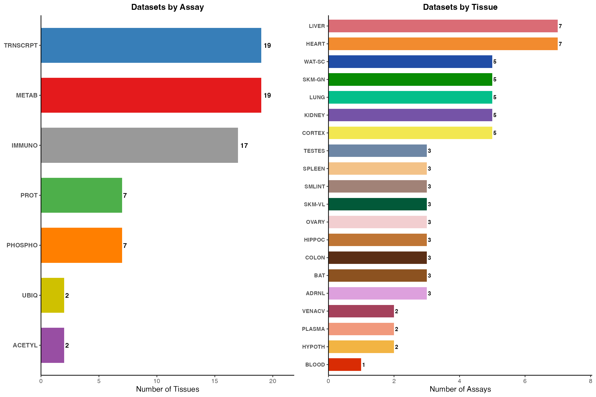
Map Gene Symbols to Features
Now we need to map our gene symbols to the various feature identifiers used across different omics platforms:
# Load feature-to-gene mapping
data(FEATURE_TO_GENE)

# Filter for our genes of interest
gene_features <- FEATURE_TO_GENE %>%
  filter(gene_symbol %in% custom_genes) %>%
  select(gene_symbol, feature_ID) %>%
  distinct()

cat("Found", nrow(gene_features), "feature-to-gene mappings for",
    length(unique(gene_features$gene_symbol)), "of your",
    length(custom_genes), "input genes\n\n")
#> Found 2049 feature-to-gene mappings for 10 of your 10 input genes
Extract Results for Your Genes
Filter the differential analysis results to include only your genes of interest:
# Join with differential analysis results
custom_gene_results <- da_results %>%
  inner_join(gene_features, by = "feature_ID") %>%
  filter(!is.na(logFC), !is.na(adj_p_value))

cat("Retrieved", nrow(custom_gene_results), "differential analysis results\n")
#> Retrieved 5996 differential analysis results
cat("for", length(unique(custom_gene_results$gene_symbol)), "genes\n")
#> for 10 genes
cat("across", length(unique(custom_gene_results$tissue)), "tissues\n")
#> across 20 tissues
cat("and", length(unique(custom_gene_results$assay)), "omics platforms\n\n")
#> and 6 omics platforms

# Show gene coverage across omics platforms
gene_omics_summary <- custom_gene_results %>%
  select(gene_symbol, assay) %>%
  distinct() %>%
  group_by(gene_symbol) %>%
  summarise(omics_layers = paste(sort(unique(assay)), collapse = ", "),
            n_omics = n(),
            .groups = "drop") %>%
  arrange(desc(n_omics), gene_symbol)

cat("Gene coverage across omics platforms:\n")
#> Gene coverage across omics platforms:
print(gene_omics_summary)
#> # A tibble: 10 × 3
#>    gene_symbol omics_layers                          n_omics
#>    <chr>       <chr>                                   <int>
#>  1 Cpt1b       ACETYL, PHOSPHO, PROT, TRNSCRPT, UBIQ       5
#>  2 Myh7        ACETYL, PHOSPHO, PROT, TRNSCRPT, UBIQ       5
#>  3 Acadm       ACETYL, PHOSPHO, PROT, TRNSCRPT             4
#>  4 Slc2a4      PHOSPHO, PROT, TRNSCRPT, UBIQ               4
#>  5 Vegfa       IMMUNO, PHOSPHO, PROT, TRNSCRPT             4
#>  6 Nrf1        PHOSPHO, PROT, TRNSCRPT                     3
#>  7 Pdk4        PHOSPHO, PROT, TRNSCRPT                     3
#>  8 Ppargc1a    PHOSPHO, PROT, TRNSCRPT                     3
#>  9 Ucp1        PROT, TRNSCRPT                              2
#> 10 Hif1a       TRNSCRPT                                    1
cat("\n")

# Check which genes have significant results (adj_p < 0.05)
sig_genes <- custom_gene_results %>%
  filter(adj_p_value < 0.05) %>%
  group_by(gene_symbol) %>%
  summarise(
    n_significant = n(),
    n_tissues = n_distinct(tissue),
    n_omics = n_distinct(assay),
    .groups = "drop"
  ) %>%
  arrange(desc(n_significant))

cat("Genes with significant training effects (FDR < 0.05):\n")
#> Genes with significant training effects (FDR < 0.05):
print(sig_genes)
#> # A tibble: 7 × 4
#>   gene_symbol n_significant n_tissues n_omics
#>   <chr>               <int>     <int>   <int>
#> 1 Ucp1                    8         2       1
#> 2 Slc2a4                  5         4       2
#> 3 Acadm                   4         4       3
#> 4 Cpt1b                   2         2       1
#> 5 Myh7                    1         1       1
#> 6 Pdk4                    1         1       1
#> 7 Ppargc1a                1         1       1
Visualization 1: Summary Tables
Create a comprehensive table of results
Display logFC and adjusted p-values for each gene across tissues and time points.
How to interpret this table:
- logFC (log2 Fold Change): Positive values = upregulation with training; negative values = downregulation
- Adjusted p-value: FDR-corrected p-values; values < 0.05 are typically considered significant
- Comparison groups: 1w, 2w, 4w, 8w represent weeks of endurance training
- Use the filters at the top of each column to search for specific genes, tissues, or omics
- Sort by clicking column headers to find the largest changes or most significant results
# Create a detailed summary table
summary_table <- custom_gene_results %>%
  select(gene_symbol, assay, tissue, sex, comparison_group, logFC, adj_p_value) %>%
  mutate(
    logFC = round(logFC, 3),
    adj_p_value = round(adj_p_value, 4),
    significance = case_when(
      adj_p_value < 0.001 ~ "***",
      adj_p_value < 0.01 ~ "**",
      adj_p_value < 0.05 ~ "*",
      TRUE ~ ""
    )
  ) %>%
  arrange(gene_symbol, assay, tissue, sex, comparison_group)

# Display interactive table
DT::datatable(
  summary_table,
  filter = 'top',
  options = list(
    pageLength = 25,
    scrollX = TRUE,
    autoWidth = TRUE
  ),
  caption = "Differential Analysis Results for Custom Gene List. Significance: *** p<0.001, ** p<0.01, * p<0.05"
) %>%
  DT::formatStyle(
    'adj_p_value',
    backgroundColor = DT::styleInterval(c(0.05), c('#ffcccc', '#ffffff'))
  )
Visualization 2: Temporal Trajectories
Line Plots for Individual Genes
Use plot_feature_logfc() to visualize how each gene’s
expression changes over the training time course:
# Get unique features for plotting
plot_features <- custom_gene_results %>%
  select(gene_symbol, assay, tissue, feature_ID) %>%
  distinct() %>%
  # Focus on transcriptomics and proteomics for clearer visualization
  filter(assay %in% c("TRNSCRPT"))

# Plot temporal trajectories for each gene-tissue-omics combination
for (i in 1:min(12, nrow(plot_features))) {  # Limit to first 12 for demonstration
  gene <- plot_features$gene_symbol[i]
  tissue <- plot_features$tissue[i]
  assay <- plot_features$assay[i]
  feature_id <- plot_features$feature_ID[i]

  cat("\nPlotting:", gene, "-", assay, "-", tissue, "\n")

  tryCatch({
    p <- plot_feature_logfc(
      assay = assay,
      tissue = tissue,
      feature_ID = feature_id,
      add_gene_symbol = TRUE,
      facet_by_sex = FALSE
    )
    print(p)
  }, error = function(e) {
    cat("Could not plot:", gene, "-", assay, "-", tissue, "\n")
  })
}
#>
#> Plotting: Ucp1 - TRNSCRPT - ADRNL
#>
#> Plotting: Ppargc1a - TRNSCRPT - ADRNL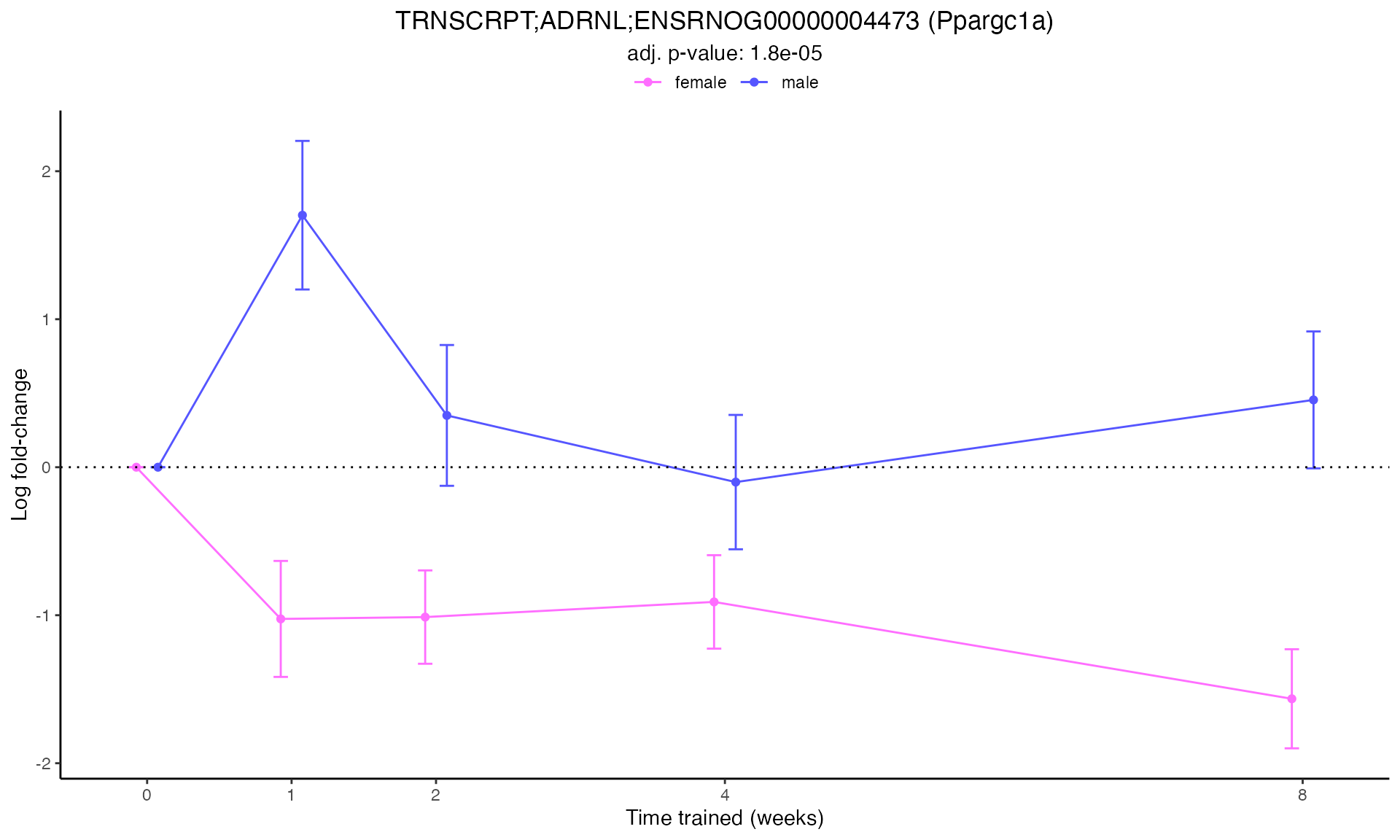
#>
#> Plotting: Hif1a - TRNSCRPT - ADRNL
#> TRNSCRPT_ADRNL_DA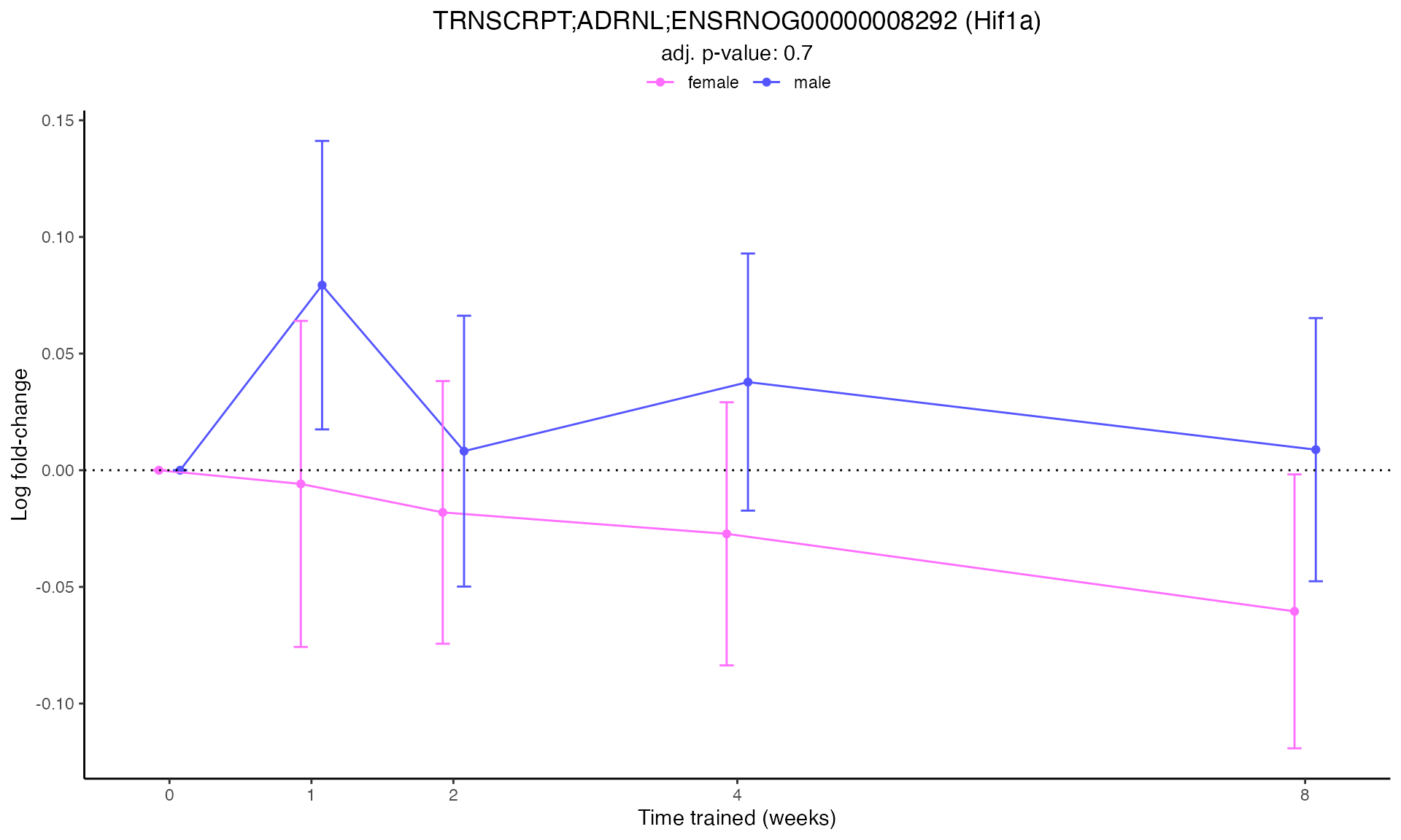
#>
#> Plotting: Nrf1 - TRNSCRPT - ADRNL
#> TRNSCRPT_ADRNL_DA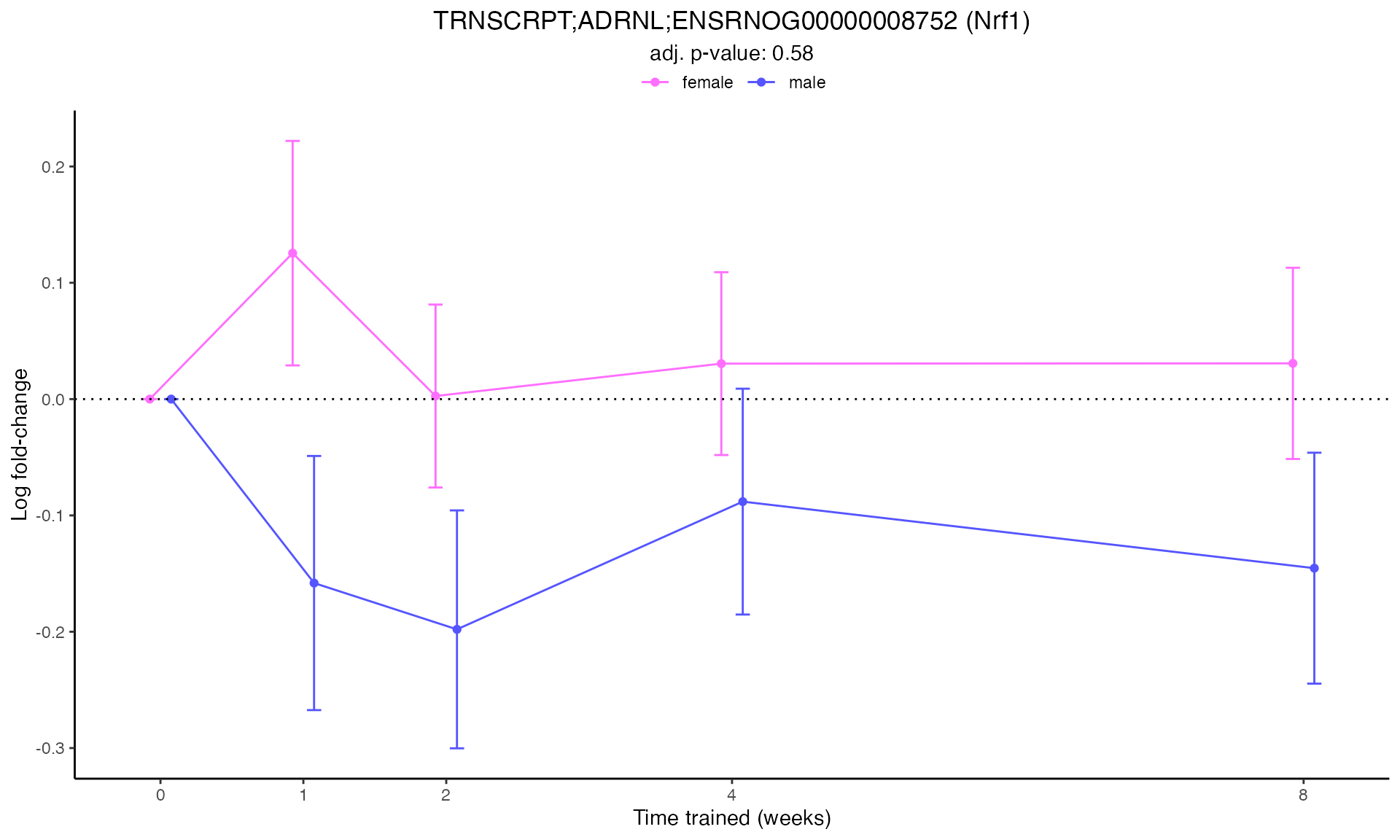
#>
#> Plotting: Pdk4 - TRNSCRPT - ADRNL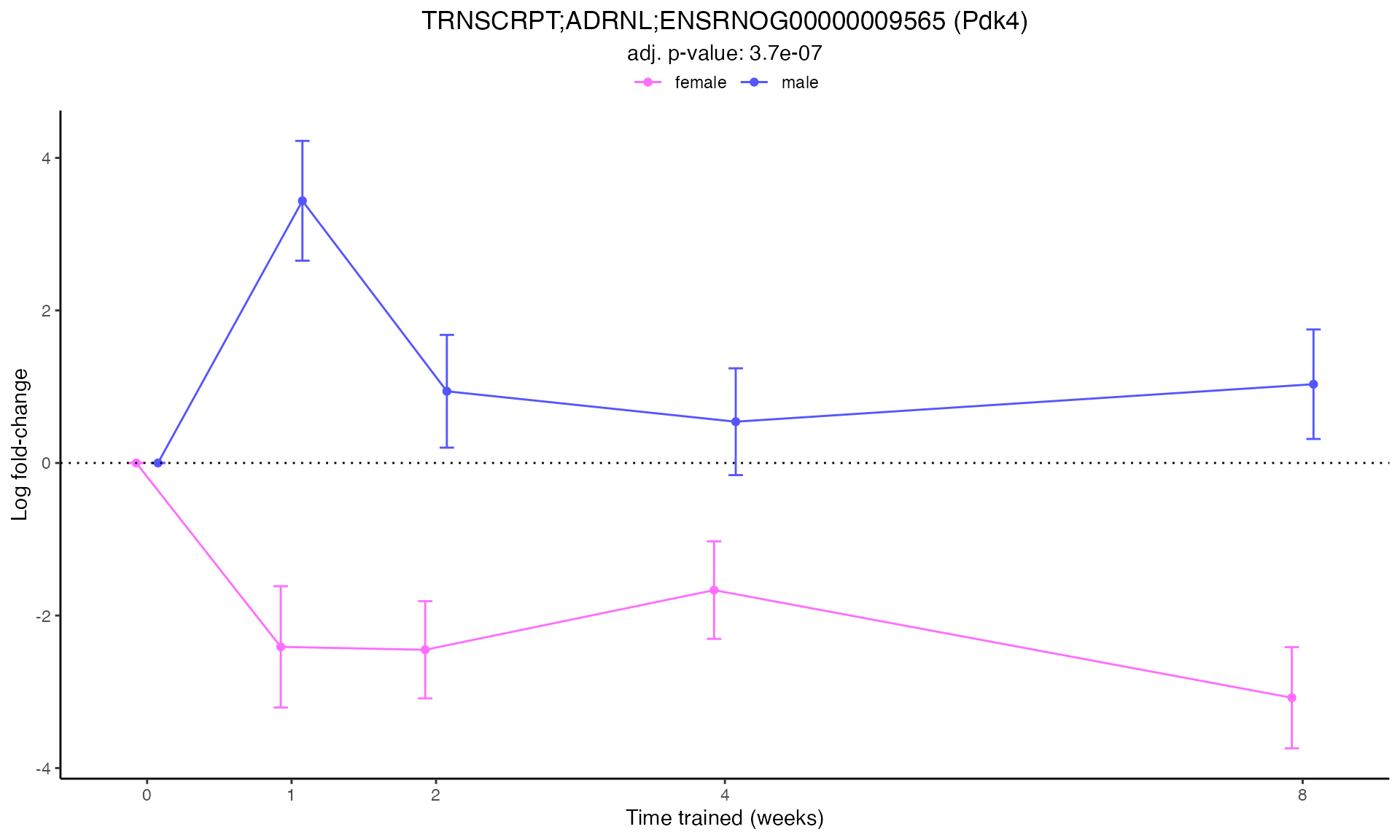
#>
#> Plotting: Acadm - TRNSCRPT - ADRNL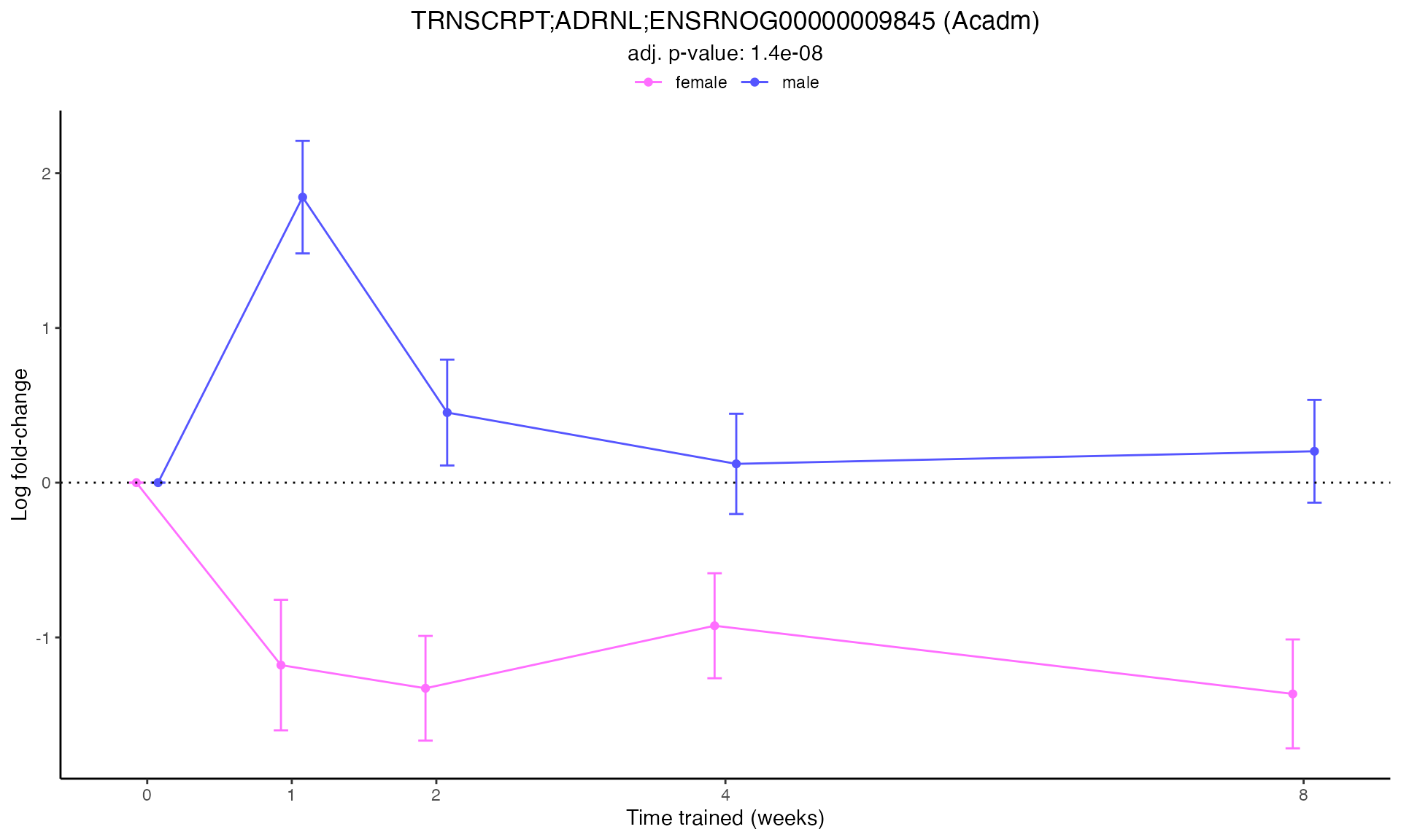
#>
#> Plotting: Cpt1b - TRNSCRPT - ADRNL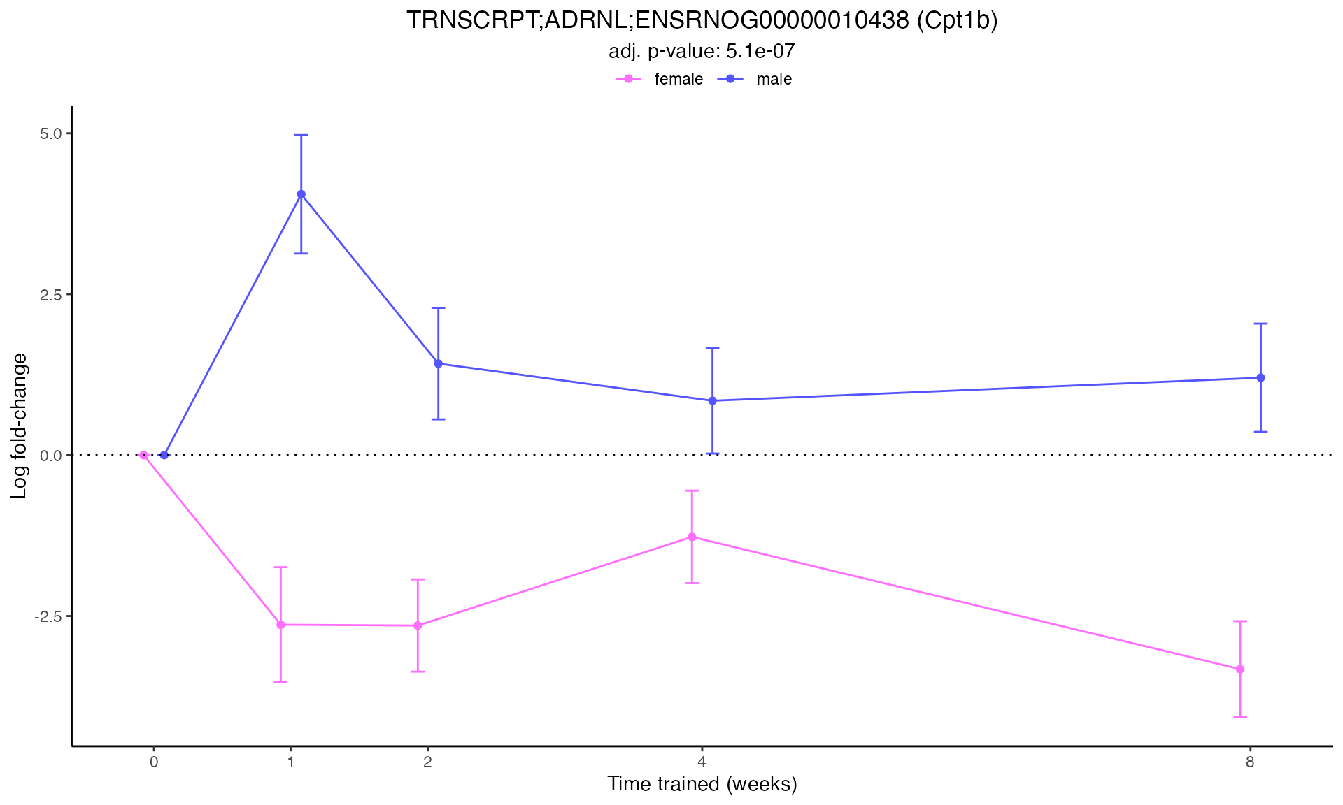
#>
#> Plotting: Myh7 - TRNSCRPT - ADRNL
#> TRNSCRPT_ADRNL_DA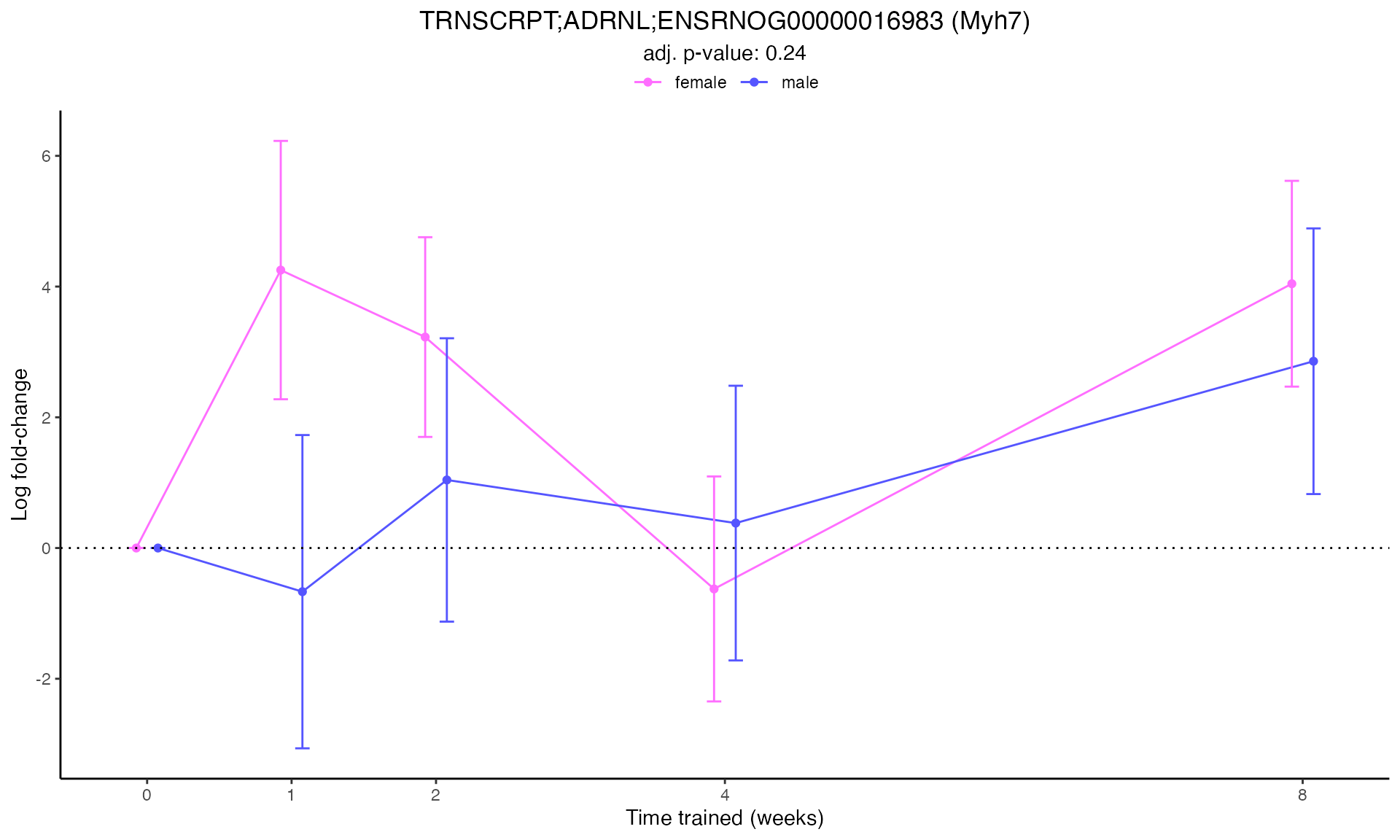
#>
#> Plotting: Slc2a4 - TRNSCRPT - ADRNL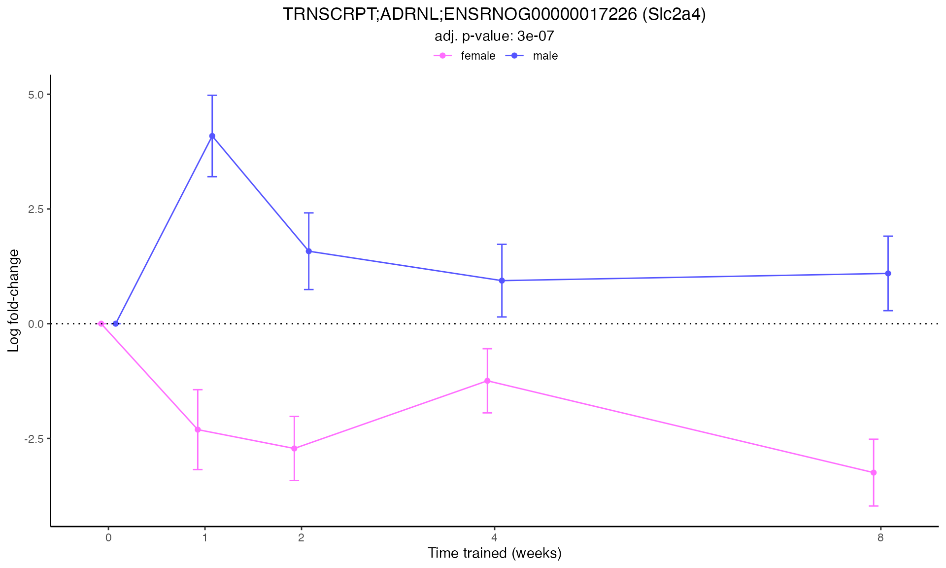
#>
#> Plotting: Vegfa - TRNSCRPT - ADRNL
#> TRNSCRPT_ADRNL_DA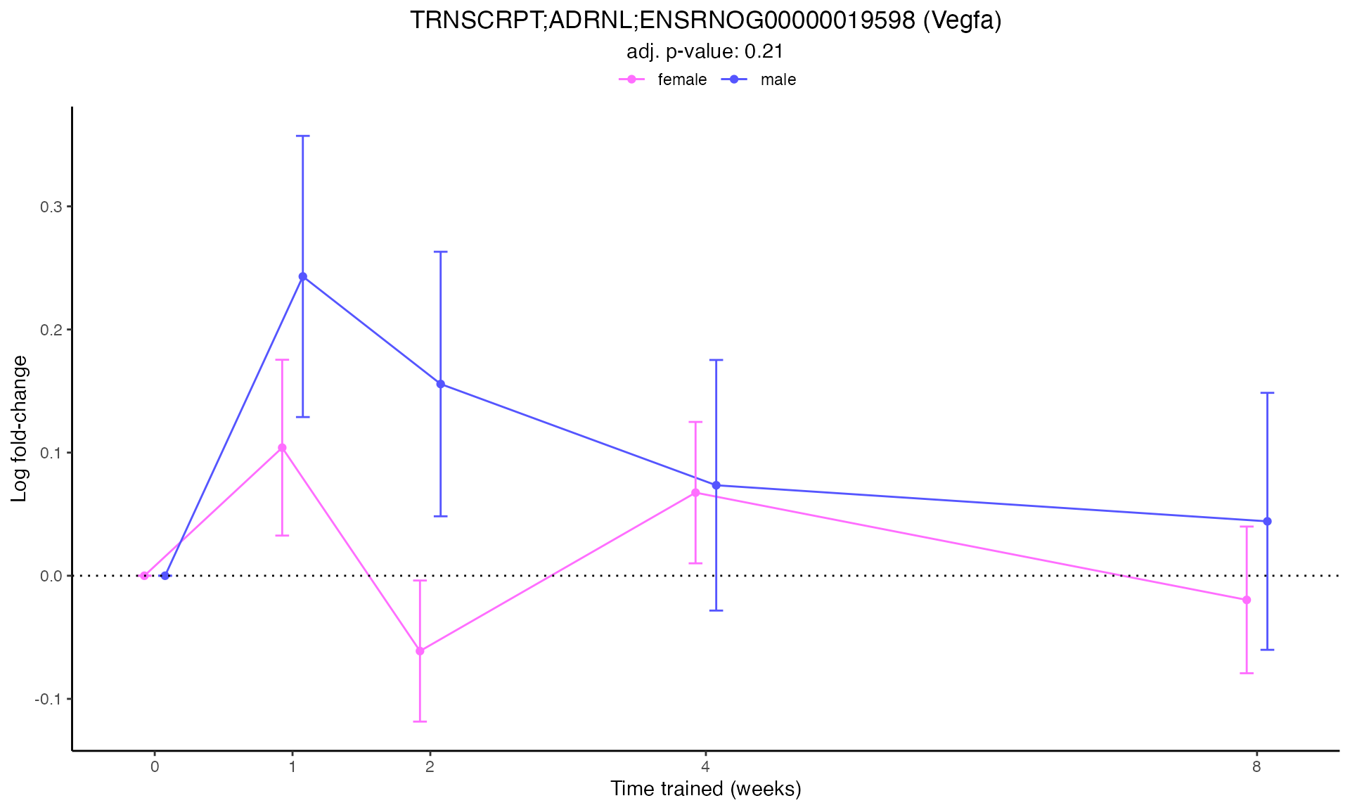
#>
#> Plotting: Ucp1 - TRNSCRPT - ADRNL
#> TRNSCRPT_ADRNL_DA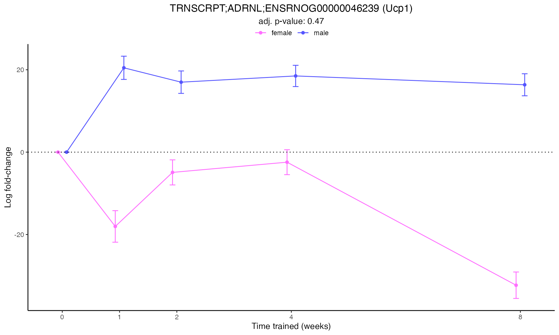
#>
#> Plotting: Ucp1 - TRNSCRPT - BAT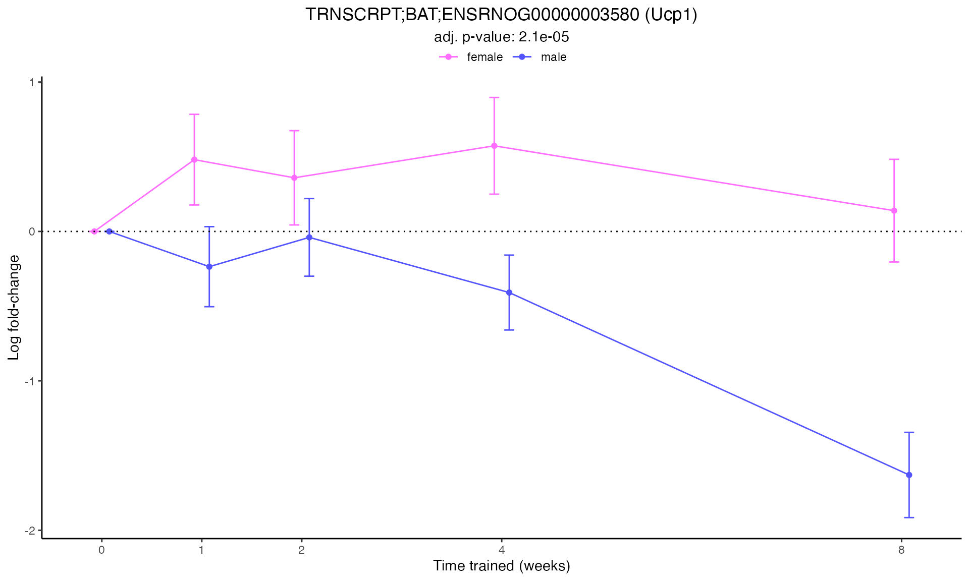
Multi-Gene Trajectory Comparison
Compare temporal patterns across all tissues for your gene of interest.
How to interpret this plot:
- Line trajectories show how gene expression changes over the training time course (1w to 8w)
- Point size indicates significance: larger points = more significant (-log10 of FDR)
- Colors represent different tissues (using official MoTrPAC tissue colors)
- Background shading: Gray area = downregulation, white area = upregulation
- Compare panels: Female (left) vs. Male (right) to identify sex-specific responses
Look for these patterns:
- Sustained response: Consistent up or down across all time points
- Early transient: Change at 1-2 weeks that returns to baseline
- Late response: Change only at 4-8 weeks (chronic adaptation)
- Biphasic: Initial change in one direction, then reversal
- Tissue specificity: Strong response in metabolic tissues (muscle, liver) vs. others
# Use the first gene from the custom gene list
selected_gene <- custom_genes[1]

trajectory_data <- custom_gene_results %>%
  filter(
    gene_symbol == selected_gene,
    assay == "TRNSCRPT",
    !is.na(comparison_group)
  )

if (nrow(trajectory_data) > 0) {
  # Convert comparison_group to factor for proper ordering
  trajectory_data <- trajectory_data %>%
    mutate(
      comparison_group = factor(comparison_group, levels = c("1w", "2w", "4w", "8w")),
      tissue = factor(tissue),
      sex = factor(sex, levels = c("female", "male"))
    )

  # Get tissue colors for available tissues
  tissues_in_data <- unique(trajectory_data$tissue)
  tissue_colors_plot <- TISSUE_COLORS[names(TISSUE_COLORS) %in% tissues_in_data]

  # Create a beautiful publication-ready plot
  p <- ggplot(trajectory_data, aes(x = comparison_group, y = logFC,
                                    color = tissue, group = tissue)) +
    # Add subtle background
    geom_rect(
      aes(xmin = -Inf, xmax = Inf, ymin = -Inf, ymax = 0),
      fill = "gray95", alpha = 0.5, inherit.aes = FALSE
    ) +
    geom_rect(
      aes(xmin = -Inf, xmax = Inf, ymin = 0, ymax = Inf),
      fill = "white", alpha = 0.5, inherit.aes = FALSE
    ) +
    # Reference line at zero
    geom_hline(yintercept = 0, linetype = "solid", color = "gray40", linewidth = 0.8) +
    # Lines with shadow effect
    geom_line(linewidth = 2.5, alpha = 0.2) +
    geom_line(linewidth = 1.5, alpha = 0.9) +
    # Points with outline
    geom_point(aes(size = -log10(adj_p_value)),
               alpha = 0.95, shape = 21, fill = "white", stroke = 1.5) +
    geom_point(aes(size = -log10(adj_p_value)),
               alpha = 0.85, shape = 16) +
    # Faceting
    facet_wrap(~ sex, labeller = labeller(sex = c(female = "Female", male = "Male"))) +
    # Colors
    scale_color_manual(values = tissue_colors_plot) +
    scale_size_continuous(
      range = c(3, 10),
      breaks = c(1, 2, 3, 5),
      labels = c("1", "2", "3", "5+")
    ) +
    # Labels
    labs(
      title = bquote(bold(italic(.(selected_gene))) ~ "Expression Across Tissues"),
      subtitle = "Transcriptomics (RNA-seq) temporal response to endurance training",
      x = "Training Duration",
      y = expression(bold(log[2] ~ "Fold Change")),
      color = "Tissue",
      size = expression(-log[10] ~ "(FDR)")
    ) +
    # Theme
    theme_minimal(base_size = 13) +
    theme(
      # Plot titles
      plot.title = element_text(face = "bold", size = 18, hjust = 0.5, margin = margin(b = 5)),
      plot.subtitle = element_text(size = 12, hjust = 0.5, color = "gray40",
                                   margin = margin(b = 15), face = "italic"),
      plot.background = element_rect(fill = "white", color = NA),

      # Axes
      axis.title.x = element_text(face = "bold", size = 13, margin = margin(t = 10)),
      axis.title.y = element_text(face = "bold", size = 13, margin = margin(r = 10)),
      axis.text = element_text(size = 11, color = "black"),
      axis.text.x = element_text(face = "bold"),
      axis.line = element_line(color = "gray30", linewidth = 0.5),

      # Facet strips
      strip.background = element_rect(fill = "gray20", color = "gray20", linewidth = 0),
      strip.text = element_text(face = "bold", size = 13, color = "white",
                               margin = margin(5, 5, 5, 5)),

      # Panel
      panel.background = element_rect(fill = "white", color = NA),
      panel.border = element_rect(color = "gray30", fill = NA, linewidth = 1),
      panel.grid.major.y = element_line(color = "gray85", linewidth = 0.4, linetype = "dotted"),
      panel.grid.major.x = element_blank(),
      panel.grid.minor = element_blank(),
      panel.spacing = unit(1.5, "lines"),

      # Legend
      legend.position = "right",
      legend.background = element_rect(fill = "gray98", color = "gray60", linewidth = 0.5),
      legend.title = element_text(face = "bold", size = 12),
      legend.text = element_text(size = 10),
      legend.key = element_rect(fill = "white", color = NA),
      legend.spacing.y = unit(0.3, "cm"),
      legend.margin = margin(10, 10, 10, 10)
    ) +
    # Guides
    guides(
      color = guide_legend(override.aes = list(size = 5, alpha = 1),
                          keyheight = unit(0.8, "cm")),
      size = guide_legend(keyheight = unit(0.6, "cm"))
    )

  print(p)
} else {
  cat("No data available for", selected_gene, "in TRNSCRPT assay\n")
}
#> Warning in geom_rect(aes(xmin = -Inf, xmax = Inf, ymin = -Inf, ymax = 0), : All aesthetics have length 1, but the data has 126 rows.
#> ℹ Please consider using `annotate()` or provide this layer with data containing
#>   a single row.
#> Warning in geom_rect(aes(xmin = -Inf, xmax = Inf, ymin = 0, ymax = Inf), : All aesthetics have length 1, but the data has 126 rows.
#> ℹ Please consider using `annotate()` or provide this layer with data containing
#>   a single row.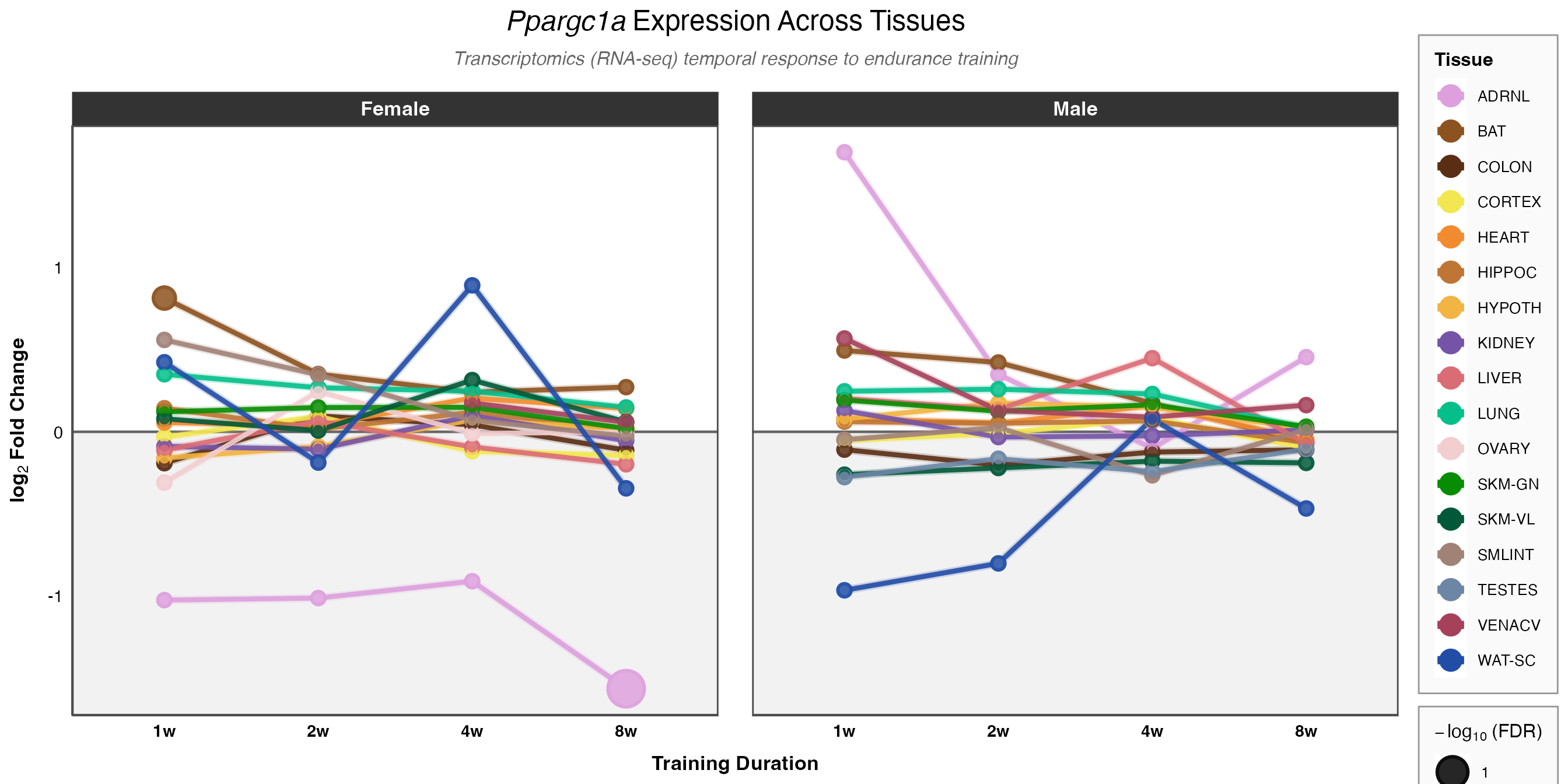
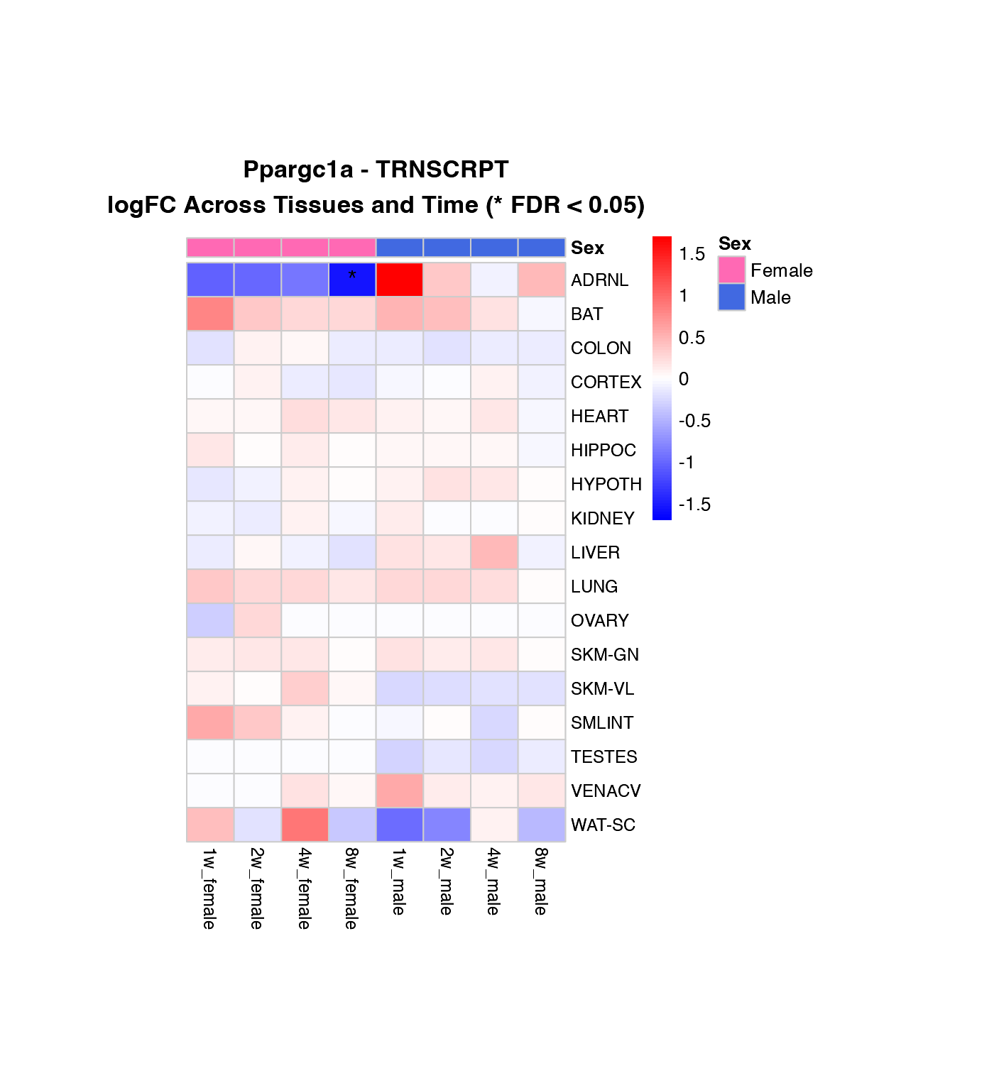
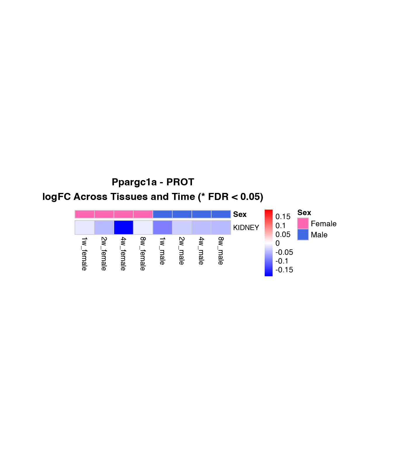
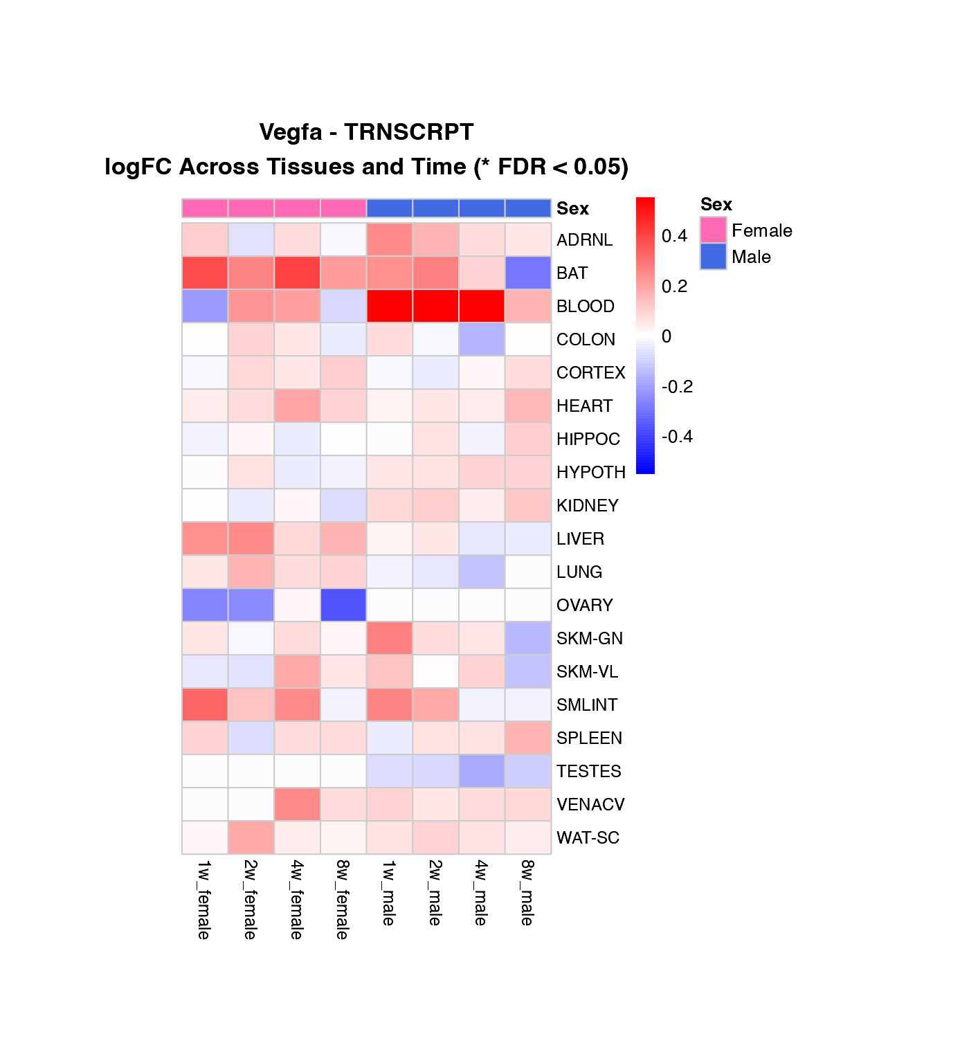
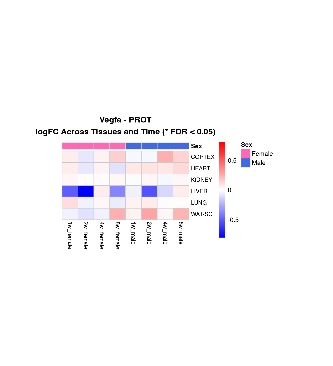
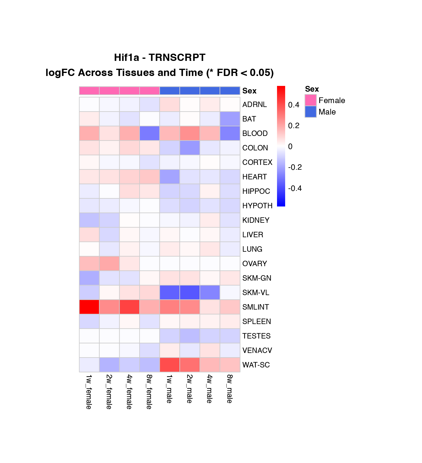
Visualization 3: Heatmaps
Heatmap of logFC Across Tissues and Time Points
Create heatmaps showing the pattern of regulation for each gene across tissues, with female and male data side-by-side.
How to interpret these heatmaps:
-
Color intensity represents magnitude and direction
of change:
- Blue = downregulation (negative logFC)
- Red = upregulation (positive logFC)
- White = no change
- **Asterisks (*)** mark statistically significant changes (FDR < 0.05)
- Column arrangement: Female time points (1w-8w) | Male time points (1w-8w)
- Rows are NOT clustered to preserve tissue order for easier comparison between genes
What to look for:
- Horizontal patterns (across time): How does the response evolve over training?
- Vertical patterns (across tissues): Which tissues show similar responses?
- Sex differences: Compare left half (female) vs. right half (male)
- Consistency: Are changes significant (*) across multiple time points?
# Function to create heatmap for a specific gene and omics layer (both sexes)
create_gene_heatmap <- function(gene_name, omics_layer) {

  # Get both logFC and p-values
  heatmap_full_data <- custom_gene_results %>%
    filter(
      gene_symbol == gene_name,
      assay == omics_layer,
      !is.na(comparison_group)
    ) %>%
    select(tissue, comparison_group, sex, logFC, adj_p_value) %>%
    # Handle duplicates by taking the mean
    group_by(tissue, comparison_group, sex) %>%
    summarise(
      logFC = mean(logFC, na.rm = TRUE),
      adj_p_value = mean(adj_p_value, na.rm = TRUE),
      .groups = "drop"
    ) %>%
    # Create combined column for time point and sex
    mutate(timepoint_sex = paste0(comparison_group, "_", sex))

  # Create logFC matrix
  heatmap_data <- heatmap_full_data %>%
    select(tissue, timepoint_sex, logFC) %>%
    pivot_wider(
      names_from = timepoint_sex,
      values_from = logFC,
      values_fill = 0
    ) %>%
    column_to_rownames("tissue")

  # Create significance matrix
  sig_data <- heatmap_full_data %>%
    select(tissue, timepoint_sex, adj_p_value) %>%
    pivot_wider(
      names_from = timepoint_sex,
      values_from = adj_p_value,
      values_fill = 1
    ) %>%
    column_to_rownames("tissue")

  if (nrow(heatmap_data) == 0) {
    cat("No data available for", gene_name, "-", omics_layer, "\n")
    return(NULL)
  }

  # Order columns: female time points, then male time points
  time_order <- c("1w", "2w", "4w", "8w")
  female_cols <- paste0(time_order, "_female")
  male_cols <- paste0(time_order, "_male")
  desired_order <- c(female_cols, male_cols)

  # Keep only columns that exist in the data
  available_cols <- intersect(desired_order, colnames(heatmap_data))
  heatmap_data <- heatmap_data[, available_cols, drop = FALSE]
  sig_data <- sig_data[, available_cols, drop = FALSE]

  # Create display labels matrix with asterisks for significant values
  display_labels <- matrix("", nrow = nrow(heatmap_data), ncol = ncol(heatmap_data))
  display_labels[sig_data < 0.05] <- "*"
  rownames(display_labels) <- rownames(heatmap_data)
  colnames(display_labels) <- colnames(heatmap_data)

  # Get max absolute value for color scale, ensure it's not zero
  max_abs_val <- max(abs(heatmap_data), na.rm = TRUE)
  if (max_abs_val == 0) max_abs_val <- 1

  # Create annotation for column groups
  col_annotation <- data.frame(
    Sex = ifelse(grepl("_female$", colnames(heatmap_data)), "Female", "Male"),
    row.names = colnames(heatmap_data)
  )

  ann_colors <- list(Sex = c(Female = "#FF69B4", Male = "#4169E1"))

  # Create heatmap without clustering, with asterisks for significant values
  print(pheatmap(
    heatmap_data,
    cluster_rows = FALSE,
    cluster_cols = FALSE,
    scale = "none",
    color = colorRampPalette(c("blue", "white", "red"))(100),
    breaks = seq(-max_abs_val, max_abs_val, length.out = 101),
    annotation_col = col_annotation,
    annotation_colors = ann_colors,
    display_numbers = display_labels,
    number_color = "black",
    fontsize_number = 14,
    main = paste0(gene_name, " - ", omics_layer, "\nlogFC Across Tissues and Time (* FDR < 0.05)"),
    fontsize = 10,
    fontsize_row = 9,
    fontsize_col = 9,
    cellwidth = 25,
    cellheight = 18,
    border_color = "gray80",
    main_fontsize = 11
  ))
}

# Create heatmaps for the first three genes in the list
genes_to_plot <- custom_genes[1:min(3, length(custom_genes))]

for (gene in genes_to_plot) {
  if (gene %in% custom_gene_results$gene_symbol) {
    # Transcriptomics
    if ("TRNSCRPT" %in% (custom_gene_results %>% filter(gene_symbol == gene) %>% pull(assay))) {
      create_gene_heatmap(gene, "TRNSCRPT")
    }

    # Proteomics
    if ("PROT" %in% (custom_gene_results %>% filter(gene_symbol == gene) %>% pull(assay))) {
      create_gene_heatmap(gene, "PROT")
    }
  }
}
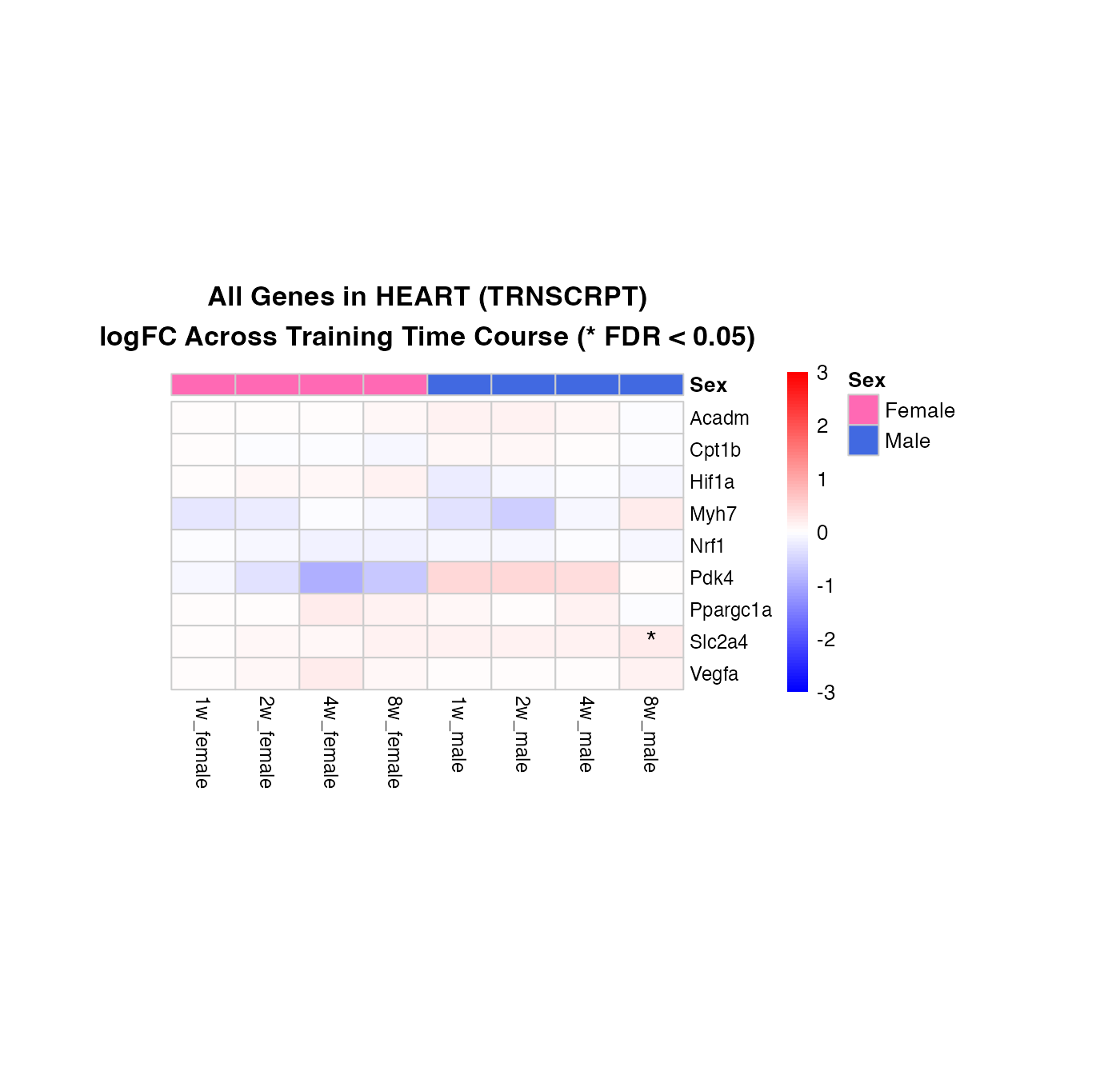
Combined Heatmap: All Genes, Selected Tissue
Compare all genes simultaneously in a specific tissue, showing both female and male responses side-by-side.
How to interpret this combined heatmap:
- Each row represents one gene from your custom list
-
Color patterns show regulation across the time
course:
- Blue = downregulation
- Red = upregulation
- Gray = no data available for that combination
- **Asterisks (*)** mark significant changes (FDR < 0.05)
- Column organization: Female time points (1w-8w) | Male time points (1w-8w)
What to look for:
- Co-regulation: Do multiple genes show similar patterns? (same color patterns across rows)
- Sex-specific responses: Are there genes that respond only in females or only in males?
- Time course patterns: Do genes show early (1-2w) or late (4-8w) responses?
- Consistency of significance: Are the strongest color changes also marked with asterisks?
# Select tissue and assay for comparison
selected_tissue <- "HEART"
selected_assay <- "TRNSCRPT"

# Get both logFC and p-values
combined_full_data <- custom_gene_results %>%
  filter(
    tissue == selected_tissue,
    assay == selected_assay,
    !is.na(comparison_group)
  ) %>%
  select(gene_symbol, comparison_group, sex, logFC, adj_p_value) %>%
  # Handle duplicates by taking the mean
  group_by(gene_symbol, comparison_group, sex) %>%
  summarise(
    logFC = mean(logFC, na.rm = TRUE),
    adj_p_value = mean(adj_p_value, na.rm = TRUE),
    .groups = "drop"
  ) %>%
  # Create combined column for time point and sex
  mutate(timepoint_sex = paste0(comparison_group, "_", sex))

# Create logFC matrix
combined_data <- combined_full_data %>%
  select(gene_symbol, timepoint_sex, logFC) %>%
  pivot_wider(
    names_from = timepoint_sex,
    values_from = logFC,
    values_fill = NA
  ) %>%
  column_to_rownames("gene_symbol")

# Create significance matrix
combined_sig_data <- combined_full_data %>%
  select(gene_symbol, timepoint_sex, adj_p_value) %>%
  pivot_wider(
    names_from = timepoint_sex,
    values_from = adj_p_value,
    values_fill = 1
  ) %>%
  column_to_rownames("gene_symbol")

if (nrow(combined_data) > 0) {
  # Order columns: female time points, then male time points
  time_order <- c("1w", "2w", "4w", "8w")
  female_cols <- paste0(time_order, "_female")
  male_cols <- paste0(time_order, "_male")
  desired_order <- c(female_cols, male_cols)

  # Keep only columns that exist in the data
  available_cols <- intersect(desired_order, colnames(combined_data))
  combined_data <- combined_data[, available_cols, drop = FALSE]
  combined_sig_data <- combined_sig_data[, available_cols, drop = FALSE]

  # Create display labels matrix with asterisks for significant values
  combined_display_labels <- matrix("", nrow = nrow(combined_data), ncol = ncol(combined_data))
  combined_display_labels[combined_sig_data < 0.05] <- "*"
  rownames(combined_display_labels) <- rownames(combined_data)
  colnames(combined_display_labels) <- colnames(combined_data)

  # Create annotation for column groups
  col_annotation <- data.frame(
    Sex = ifelse(grepl("_female$", colnames(combined_data)), "Female", "Male"),
    row.names = colnames(combined_data)
  )

  ann_colors <- list(Sex = c(Female = "#FF69B4", Male = "#4169E1"))

  pheatmap(
    combined_data,
    cluster_rows = FALSE,
    cluster_cols = FALSE,
    scale = "none",
    color = colorRampPalette(c("blue", "white", "red"))(100),
    breaks = seq(-3, 3, length.out = 101),
    annotation_col = col_annotation,
    annotation_colors = ann_colors,
    display_numbers = combined_display_labels,
    number_color = "black",
    fontsize_number = 14,
    main = paste0("All Genes in ", selected_tissue, " (", selected_assay, ")\nlogFC Across Training Time Course (* FDR < 0.05)"),
    fontsize = 10,
    fontsize_row = 9,
    fontsize_col = 9,
    cellwidth = 30,
    cellheight = 15,
    na_col = "grey90",
    border_color = "gray80",
    main_fontsize = 11
  )
} else {
  cat("No data available for the selected combination\n")
}
Next Steps
Customizing This Workflow
You can adapt this vignette by:
-
Changing the gene list: Replace
custom_geneswith your genes of interest -
Focusing on specific tissues: Modify
selected_tissuein the heatmap sections - Selecting omics layers: Focus on specific assays (TRNSCRPT, PROT, PHOSPHO, ACETYL, UBIQ, METAB)
- Adjusting significance thresholds: Change the 0.05 FDR cutoff
-
Adding normalized data: Use
combine_normalized_data()to get actual expression values